Going responsive for Learn Apps close

The way we browse the Web has changed. People no longer only use desktops or laptop computers: they consume the Web through a multitude of mobile devices, sporting all kinds of screen shapes and resolutions.
The traditional fixed-width layout doesn't really cut it anymore. People expect to be able to view sites on their phones just like they do on their desktop computer. Sites need to adapt to these different browsers and screen resolutions. But what's the right way to do it?
The common response has been for sites to provide a mobile version as a nice little "extra". That's good, but it doesn't always mean the site will display nicely on an iPad or non-iOS mobile devices. This also often means developers will have to maintain two distinct websites, with their own sets of content.
Unfortunately, this doesn't scale well, and it restricts access to the content to only a few selected devices.
The better way to do it is with what we call Responsive Web Design.
The idea behind Responsive Web Design is that the websites' layout and design should adapt to fit any device that chooses to display it.
As Ethan Marcotte explains, "Rather than tailoring disconnected designs to each of an ever-increasing number of web devices, we can treat them as facets of the same experience. We can design for an optimal viewing experience, but embed standards-based technologies into our designs to make them not only more flexible, but more adaptive to the media that renders them."
This is why last week, codegent released a revamped, responsive and mobile-friendly website for our Learn Apps. The site is still a work in progress (there's a few things that need to be ironed out), but we think it's good enough to take a little tour today!

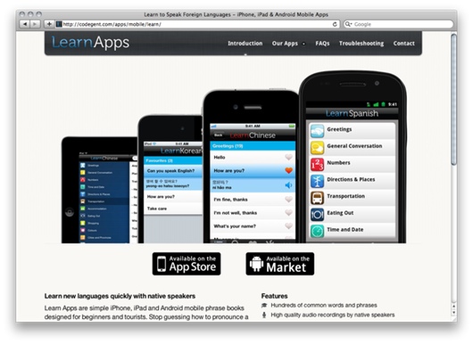
Learn Apps homepage as seen on a desktop browser

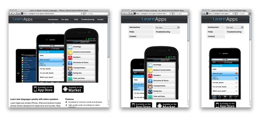
The homepage adapting to smaller resolutions
Here's the effect in video

The Learn Thai page adapting to various resolutions
Some small details that make the difference:
- One website "code", working on a wide range of desktop as well as mobile browsers (including Safari Mobile, Firefox Mobile, Opera Mobile and Opera Mini)
- The header "Our Apps" dropdown is automatically replaced by a Select dropdown for ease of use on mobile devices (ie. works with touch screens devices as well as non-touch screens devices).
- The iPhone and iPod will see an iPhone 4 capture of the apps, while Android handsets should see captures from a Nexus S
- The Contact form uses the JavaScript library called "Chosen" to make it easier for users to find and select apps/devices, by replacing the default Select dropdown with a custom dropdown with auto-complete search (on desktop browsers)
We invite you to go through the website yourself: www.codegent.com/learnapps and have a play!
We are quite pleased with the results so far, and are thrilled to offer more "responsiveness" in future projects! Let us know what you think in the comments.