Mobile Web Browsing close
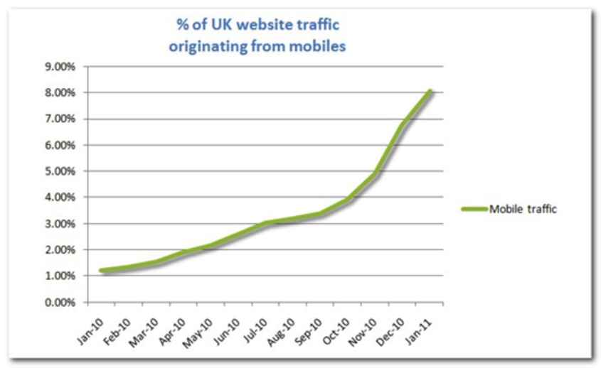
Source: Tecmark
The time for waiting is over
Back in September 2009, when mobile was being heralded as the next big thing, the amount of web traffic that actually came from a mobile was still only a measly 0,02%. Most of us thought, let’s just wait and see.
- By September the following year … it was just above 3%. Still… wait and see?
- By January of 2011, it had grown to 8.09%. Erm... that’s getting significant.
- Predictions are that it will reach about 15% by June 2011.
So how do we feel about the experience that 15% of people who access your website currently have?
There are 3 key considerations when it comes to thinking about mobile traffic:
- User experience. We determine how the user is accessing the site and render in a way that the user experience is a rewarding one based on their device. There shouldn’t be any horizontal scrolling or the need to be constantly growing and shrinking the page.
- Consistent. Your mobile site should use the same database as your standard site. If content is updated, it should be updated everywhere at the same time.
- Use case. This one is a bit trickier, but think about your own experience. When you are browsing a site from a mobile, chances are you are doing it on the move and you have a different set of requirements than if you are browsing from work or at home on a regular computer. This means that the type of content you surface might be different across different platforms.
Some examples:
Codegent
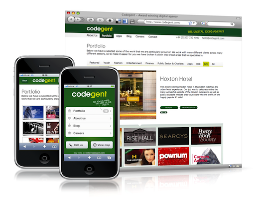
Well, maybe we need to put our money where our mouth is. We created a mobile version of our site over a year ago. And we applied the three considerations above. We believed that anyone accessing our site from a mobile was probably doing so because they wanted to get in touch with us. So we ensured that they could call us straight from the homepage and that a map was easy to find.
Illy Issimo
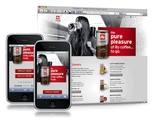
This is a very simple site. But there is no need for horizontal scrolling and the use case is that people will be online if they want to either find a store when they are out and about, or possibly even buy online there and then. The regular website focuses more on the products themselves and the store locator function is given less importance on the page.
About.com
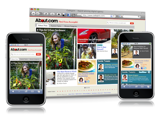
With About.com, the use case didn’t change drastically between mobile and computer interfaces. The site gives people information that they need to do the things that may enrich their day-to-day lives. So, this information could be relevant at home or on the go. But their site does make best use of the space a mobile platform provides. There is no horizontal scrolling and all the same content is featured attractively, with the hierarchy laid out in the same order as the main site: whereas on the main site hierarchy is broadly arranged left to right, top to bottom and large to small, on the mobile version, the more important items are featured nearer the top of the page.
What about apps?
Obviously, with the rise of mobile browsing has come the rise of mobile apps. Apps can either be free or revenue-generating in themselves.
Whilst apps can pull in location-based information and data from online, some companies are using apps as a means of giving people their content in a simplified way without the need to always be online. This depends on how immediate the content needs to be of course: there isn’t much point in having a social network or news site sat on an app that doesn’t need internet access, however if your site contains information that doesn’t change that often but is useful for users for regular reference, then an app might be the route.
The issue with apps however, is that people will only ever want a finite amount sat on their phones. So, if your site is primarily sales information, unless it somehow supports the end-user regularly, then an app might not be the route to go.
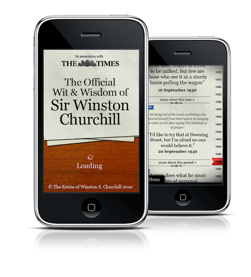
Winston Churchill – Official Wit & Wisdom
We developed this app in association with The Times newspaper and the Winston Churchill Estate. An app which gives people access to the quotes and writings of Sir Winston Churchill was ideal content for an app.
Inside Ferrari
Meanwhile, photographer Jon Nicholson, recognised that the iPad was a great device to showcase his work. We started with a project he did behind the scenes of Ferrari’s Formula 1 team.

We’ve written more about the business of apps for those who want to explore this further:
App Store Optimization
App Payback - What Business Model Works Best?
Publishing on the iPad - Where's the Paper Boy gone?
If you want to talk about how you should be presenting your brand and your content across mobile, then please do get in touch.